Ruxandra DuruOrange is not my color (2/3)The logic behind the colors that look good on us and how to get away with those that don’t. Part 2: INTENSITY5 min read·Feb 15, 2022----
Ruxandra DuruColor and coffeeColor impressions from a novice coffee-drinker7 min read·Jan 24, 2022--3--3
Ruxandra DuruOrange is not my color (1/3)The logic behind the colors that look good on us and how to get away with those that don’t. Part 1: VALUE4 min read·Nov 9, 2021--1--1
Ruxandra DuruinBootcampAn ode to yellow and pinkAnd why it is a joyful, positive colour combination2 min read·Nov 8, 2021--1--1
Ruxandra DuruinBootcampHow to create color palettes around black and whiteHint: bold colors, shades and tints make good companions3 min read·Sep 30, 2021--1--1
Ruxandra DuruinBootcampHarmonious color palettesApproaches to creating groups of colors that pleasantly agree with each other4 min read·Aug 1, 2021--1--1
Ruxandra DuruinBootcampHalfway color combinationsBeyond complementary and analogous combinations6 min read·Jun 14, 2021--1--1
Ruxandra DuruinBootcampColor, gradients, and blurry boundariesWhat I have learned from working with color in a fuzzy context5 min read·Mar 5, 2021--1--1
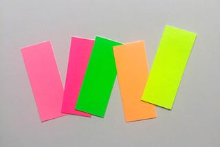
Ruxandra DuruinBootcampFluorescent Colors Are Loud and Can Be Tricky To Use and Combine: Here’s How To Do It GentlyDon’t mariekondo your fluorescent yellow t-shirt yet3 min read·Jan 21, 2021--1--1
Ruxandra DuruinThe StartupTwo-Color Combinations: A ToolkitHow I learned to combine colors more intentionally by focusing on the amount of stimulation they create.12 min read·Dec 22, 2020--2--2